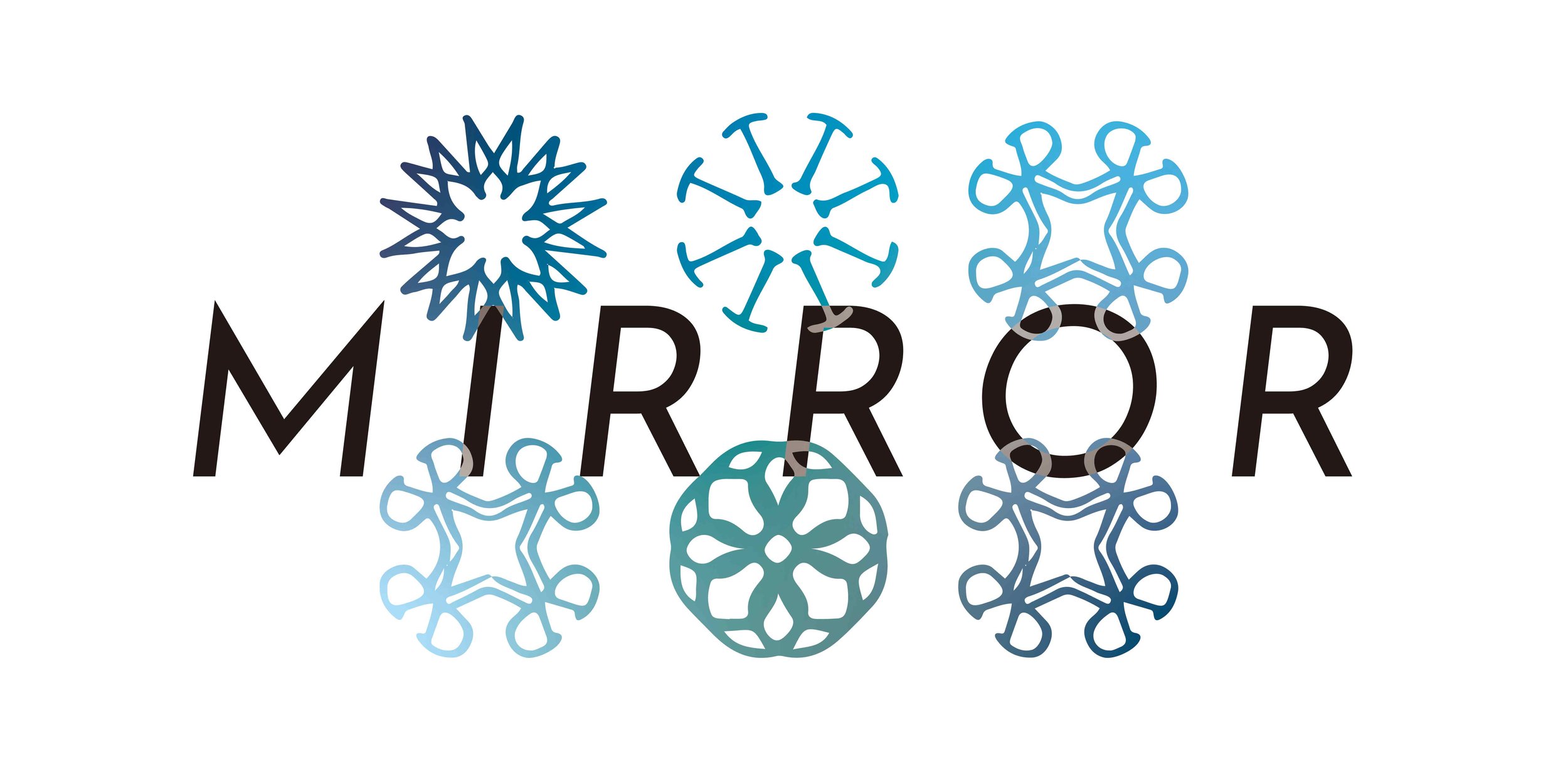
"Mirror" is a typeface designed by myself based on traditional English alphabet. Inspired by the symmetrical identity of Chinese characters, I thought of what would happen if English alphabet could be symmetrical, and how the message it would convey after than that.
Several later projects and experiments are based on this typefaces as well.
During this process, the existed English cultural identity within the typeface has been weakened and been replaced by another cultural element. What is new for audience? The shape, the feeling, the decorative values, the hidden context, and maybe more.
