
Jiacheng Logistics
Branding
Shenzhen Jiacheng Global Logistics is a new born global logistics company. Its purpose is to provide affordable and convenient import and export service to its customers.
As Jiacheng Logistics didn’t have visual system design and branding plan in the past, received the request from client, I started to build a lively, energetic and positive brand impression for them from zero.

By analyzing the branding style of existed logistics companies, I used the shape of delivery box to be the base of the logotype, and chose to apply the concept of “convenience,””high-speed,””international” to the design, and created corresponding color palette for it.
The color palette consists of high-saturated and bright colors. After consideration, the logotype was decided to be in orange and light blue to represent the identity of the company.
Logotype Design

Logotype with Text


Alternative color palette and logotype design

Business card
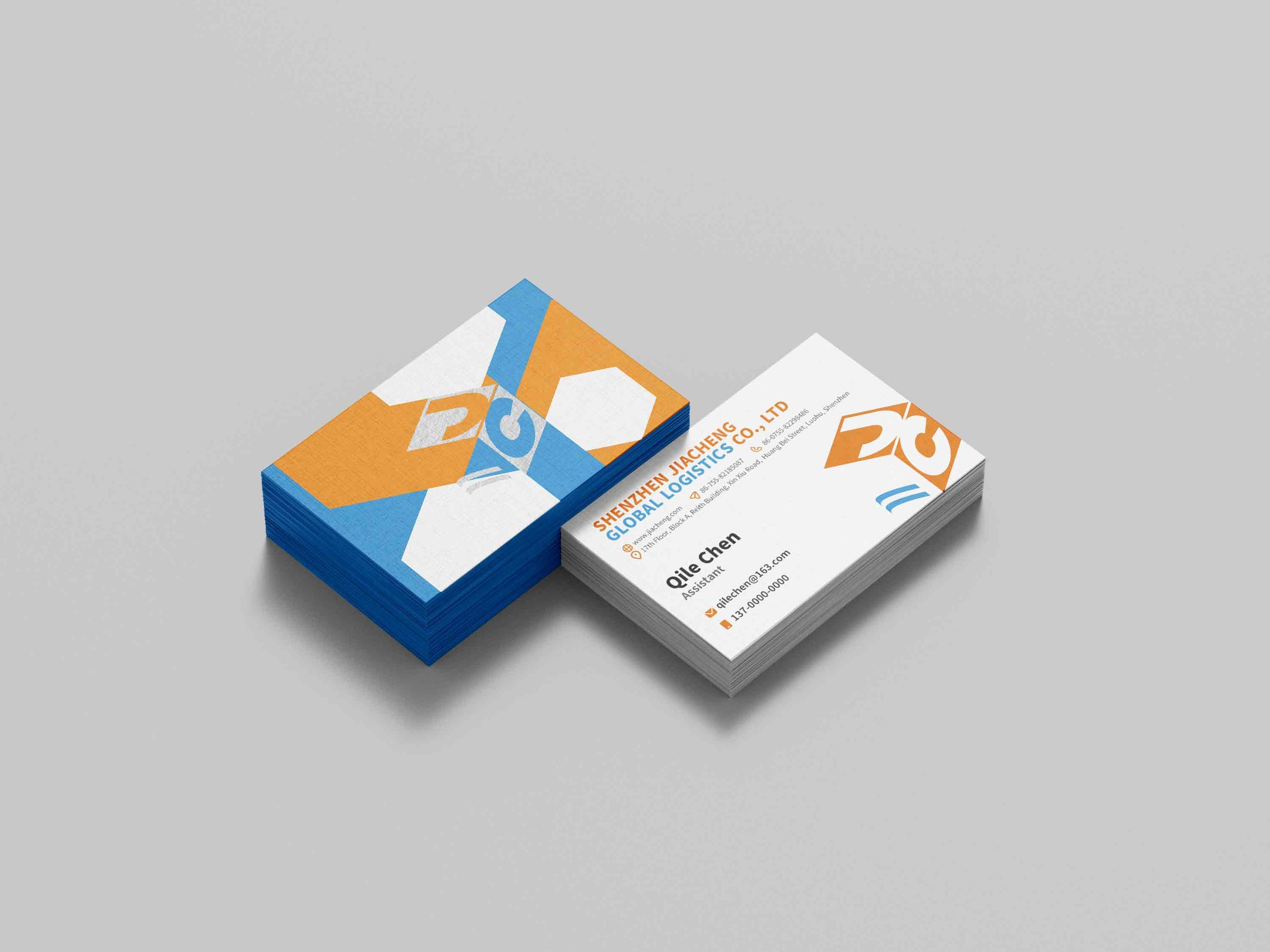
Business card

Paper bag

Paper bag
Name card

T-shirt

T-shirt
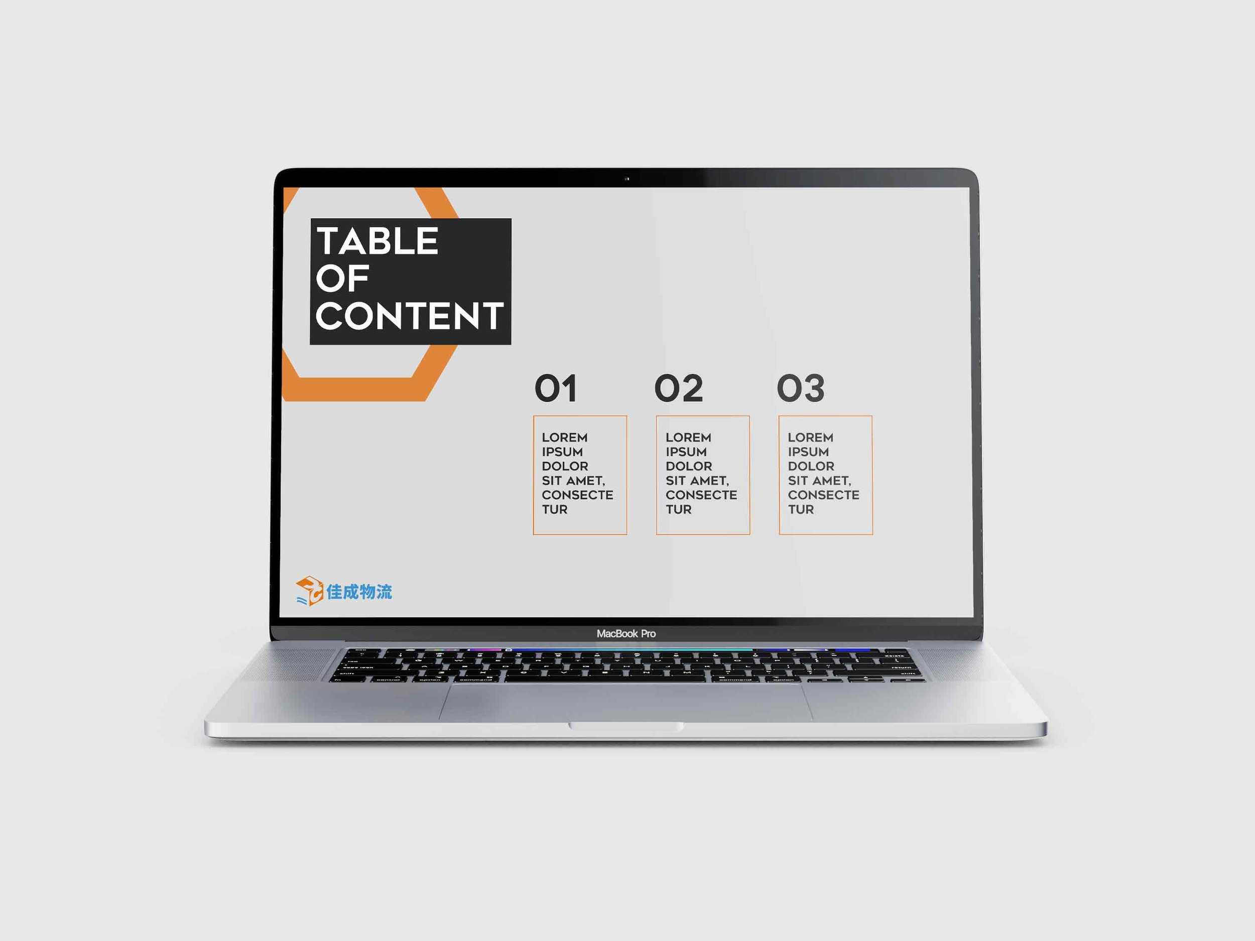
Slideshow page

Stationaries

Moving box